Downstream Analysis#
After performing all of the preprocessing with spatialproteomics, you typically want to use other packages to extract further information from the data. Here, we show two examples, one using squidpy and the other one using the R package spatstat. Spatialproteomics provides several ways to export your data to facilitate interoperability with external tools.
If you want to follow along with this tutorial, you can download the data here.
[1]:
import os
import sys

# setup for rpy2 to use the correct R binary
env_r_bin = "/g/huber/users/meyerben/.conda/envs/tmp_env_3/bin"
os.environ["PATH"] = env_r_bin + os.pathsep + os.environ.get("PATH", "")
if "R_HOME" in os.environ:
    del os.environ["R_HOME"]

%load_ext rpy2.ipython

import xarray as xr
import spatialproteomics as sp
import pandas as pd
import squidpy as sq

celltype_colors = {
    "B cell": "#5799d1",
    "T cell": "#ebc850",
    "Myeloid cell": "#de6866",
    "Dendritic cell": "#4cbcbd",
    "Macrophage": "#bb7cb4",
    "Stromal cell": "#62b346",
    "Endothelial cell": "#bf997d",
}
/home/meyerben/meyerben/.conda/envs/tmp_env_3/lib/python3.10/site-packages/dask/dataframe/__init__.py:31: FutureWarning: The legacy Dask DataFrame implementation is deprecated and will be removed in a future version. Set the configuration option `dataframe.query-planning` to `True` or None to enable the new Dask Dataframe implementation and silence this warning.
  warnings.warn(
[2]:
# loading in a data set
ds = xr.open_zarr("../../data/LN_24_1.zarr")
# for clearer visualizations, we set the cell types to the broadest level (B cells, T cells, ...)
ds = ds.la.set_label_level("labels_0", ignore_neighborhoods=True).la.set_label_colors(
    celltype_colors.keys(), celltype_colors.values()
)
Neighborhood Enrichment with Squidpy#
We can use the pp.convert_to_anndata() function to turn the spatialproteomics object into an anndata object that is accepted by squidpy. We can then follow the squidpy documentation to perform an enrichment analysis.
[3]:
adata = ds.tl.convert_to_anndata()
adata
[3]:
AnnData object with n_obs × n_vars = 18134 × 56
    obs: 'BCL-2_binarized', 'BCL-6_binarized', 'CD163_binarized', 'CD45RA_binarized', 'CD45RO_binarized', 'CD8_binarized', 'DAPI_binarized', 'FOXP3_binarized', 'Helios_binarized', 'ICOS_binarized', 'PD-1_binarized', 'TCF7-TCF1_binarized', 'Tim3_binarized', '_labels', '_neighborhoods', 'centroid-0', 'centroid-1', 'degree', 'diversity_index', 'homophily', 'inter_label_connectivity'
    uns: '_labels_colors'
    obsm: 'spatial'
[4]:
sq.gr.spatial_neighbors(adata, coord_type="generic", radius=140)
sq.gr.nhood_enrichment(adata, cluster_key="_labels")
sq.pl.nhood_enrichment(adata, cluster_key="_labels")
/home/meyerben/meyerben/.conda/envs/tmp_env_3/lib/python3.10/site-packages/squidpy/gr/_nhood.py:202: RuntimeWarning: invalid value encountered in divide
  zscore = (count - perms.mean(axis=0)) / perms.std(axis=0)
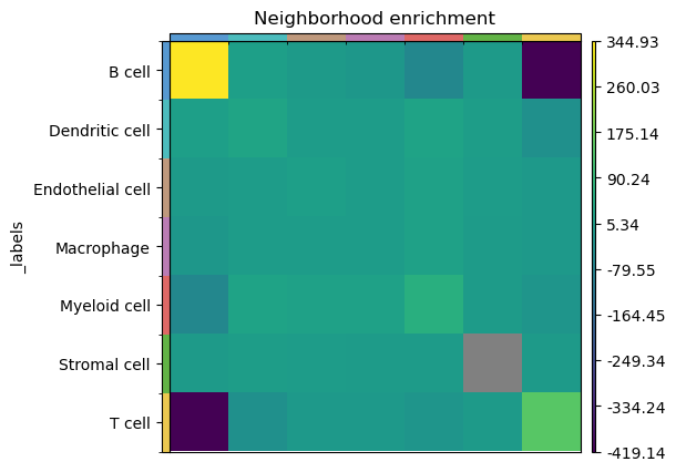
We see that in this sample, B cells frequently cluster together, while B and T cells have a negative enrichment score, meaning that the two do not mix very often.
Downstream Analysis in R using spatstat#
R has a great analysis ecosystem for spatial data, hence it can be desirable to continue analysis with packages such as spatstat. Below we show how you can export your data in an R-friendly format and perform some basic analysis using the spatstat package.
[5]:
# getting the spatial information and cell types from the spatialproteomics object
df = ds.pp.get_layer_as_df()[["centroid-0", "centroid-1", "_labels"]]
# renaming the columns for better compatibility with R
df.columns = ["centroid.0", "centroid.1", "labels"]
df.head()
[5]:
| centroid.0 | centroid.1 | labels | |
|---|---|---|---|
| 1 | 343.043825 | 1492.916335 | Endothelial cell |
| 2 | 341.740506 | 1517.082278 | B cell |
| 3 | 342.250000 | 1450.492857 | B cell |
| 4 | 345.150602 | 1559.259036 | B cell |
| 5 | 346.454128 | 1575.885321 | T cell |
At this point, it is most sensible to store the data frame to disk using df.to_csv('your_path.csv'), and reading it in with R. For demonstration purposes, we run R directly in this notebook.
[6]:
# send the python df to R, so that we can use it directly
%R -i df
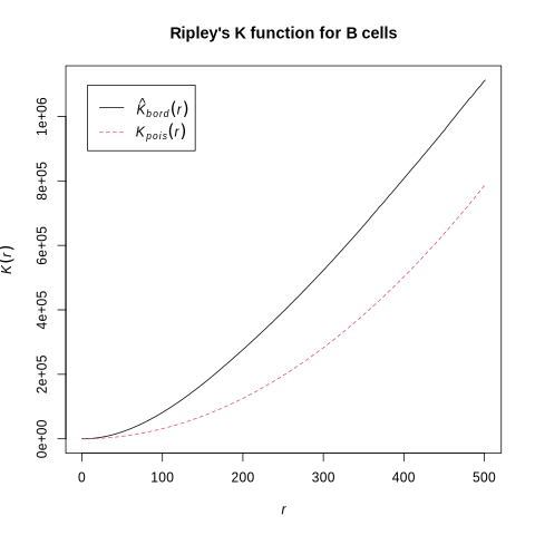
Let’s have a look at how B cells are spatially distributed in this sample. We can do this by using Ripley’s K function. We compute what this function would like like if our cells were randomly distributed, and then compute what it actually looks like. Subsequently, we can compare the two curves. Interpretation is simple: if our observed curve is above the theoretical one, there is clustering in the sample.
[7]:
%%R
library(spatstat.geom)
library(spatstat.explore)

# convex hull around centroids
cvxhull <- convexhull.xy(cbind(df$centroid.1, y=df$centroid.0))

# subset to B cells
df_subset <- df[df[["labels"]] == "B cell", ]
# point pattern of B cell centroids inside hull
P <- ppp(df_subset$centroid.1, df_subset$centroid.0, poly = cvxhull$bdry[[1]])

# Ripley's K only
K <- Kest(P)

# plotting the result
plot(K, main = "Ripley's K function for B cells")
Loading required package: spatstat.data
Loading required package: spatstat.univar
spatstat.univar 3.1-4
spatstat.geom 3.5-0
Loading required package: spatstat.random
spatstat.random 3.4-1
Loading required package: nlme
spatstat.explore 3.5-2
number of data points exceeds 3000 - computing border correction estimate only
In addition: Warning message:
2 points were rejected as lying outside the specified window
[8]:
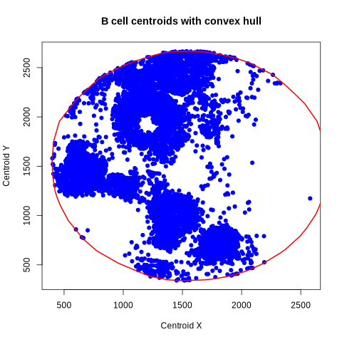
%%R
# quick visualization of the B cells and the convex hull
plot(
  df_subset$centroid.1, df_subset$centroid.0,
  xlab = "Centroid X",
  ylab = "Centroid Y",
  main = "B cell centroids with convex hull",
  pch = 19, col = "blue"
)
lines(cvxhull$bdry[[1]], col = "red", lwd = 2)